This unit contains six sections. Work through the content in order.
Typography is the art of arranging copy so that it is both legible and aesthetically appealing. It’s font selection, sizing, weight, styling, kerning, leading, alignment, and general placement on the canvas. (But more on that in a moment.)
Like every fundamental we’ve covered so far, typography is yet another crucial element when it comes to creating good designs.
As a designer working with type, you won’t be creating your own letters from scratch. You’ll be working with existing typefaces.
Typefaces are often referred to as fonts, though by definition, these two things are different:
Think of it this way: When you open your word processing software to work on a novel, there is dropdown where you can select a typeface to write in, such as Times New Roman, the standard for all novel manuscripts. This typeface is comprised of many fonts; bold, italic, condensed, etc.
In most cases, the first selection you make from the dropdown is the typeface. The sub-options are fonts.
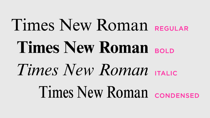
Publishing standards tell authors to format their manuscripts in 12pt Times New Roman. Not Times New Roman Bold, or Times New Roman Condensed, or any other variation. The typeface (or font family) being used is “Times New Roman” but the specific font is “Time New Roman Regular.” Sometimes an author will need to switch the font to its “bold” or “italic” iteration within the manuscript, but the standard is regular/roman.
Design projects, unfortunately, won’t have formatting rules. You’ll be selecting typefaces to use within your design as well as deciding what font variations to use when displaying them. You may not have to make these selections from scratch. As with building a color palette, some key typography hints may be lurking in your cover.
If you’re tackling a broader design project not related to any one book, have no fear. Typefaces, like colors, can communicate certain emotions and characteristics, which may help you make your decisions.
Let’s dig in…
As already discussed, many people—perhaps most people—say “font” when they mean “typeface.” Font is the very specific stylized variation of a typeface. (This is why some people prefer to call typefaces “font families.” It’s a slightly more intuitive term, really hitting home that various fonts make up one family.)
Selecting a specific font for your design actually begins at the typeface—of font family—level. More specifically, it begins with deciding what category of typeface you want to work with.

Serif typefaces include a small line (or “foot”) at the end of most strokes. Variation in stroke thickness is also common. Historically serifs are among the oldest typefaces. They typically feel formal and classic.
Popular Examples: Times New Roman, Garamond, Didot

Sans serif typefaces do NOT include these “foot”-like strokes and the thickness of strokes is often uniform. Sans serif typefaces are typically more minimal and modern.
Popular Examples: Helvetica, Verdana, Futura
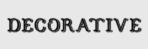
Decorative (or display) typefaces are stylized, eye-catching typefaces that only sometimes fit within serif or sans serif parameters. They are very expressive, but often too detailed to use for anything other than headline copy.

Script typefaces are stylized to look like handwriting. They can be simple (closer to handwritten print) or ornate (intricate cursive/calligraphy). These typefaces have a personal, human element to them, but like decorative fonts, they rarely work well as body copy.
While it’s true that sans serifs are more casual than serifs, not every sans serif font is going to feel casual in exactly the same way. In fact, within any typeface category, different font families will bring unique moods and personalities to your design.
Think of typeface categories like color temperatures. There are warm vs cool temperature groups, but as we learned while studying color theory, not all cool colors feel the same. A deep, dark blue can feel somber and sad while a bright, emerald green can feel lively and fresh. As you change fonts, even within the same typeface category, the personality invoked by the copy will change too.
Take a look at these examples.
Below, both examples are script typefaces, but the two fonts have wildly different personalities. Pacifico is bolder, with more more uniform letterforms, resulting in a completely different feel than the more loose and imperfect Angel Heart.
 Font: Pacifico Regular
 Font: Angel Heart Regular
Here’s another example comparing two sans serif typefaces. Notice how the mere shape of the letters (wider vs more condensed) and font weight (thin vs bold) completely changes the personality between the two.
 Font: Gotham Thin
 Font: Futura Condensed Extra Bold
So far, these examples have changed typefaces (font family) to show a shift in personality. But simply changing the font within a typeface/font family can also have an effect on personality.
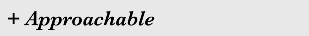
Check out this last example. In both instances, the serif typeface Baskerville is used. Notice how the personality shifts when the font changes from Regular to Semi Bold Italic. The second iteration still feels professional and classic, but the thicker strokes (bold) and slanted letterforms (italic) add a level of approachability that was missing in the Regular font.
 Font: Baskerville Regular
 Font: Baskerville Semi Bold Italic
Look to your cover when selecting fonts for your designs. You’ll likely be using more than one font in your project, so take note of the title font and the font(s) used for the author name and/or tagline. For your project, you’ll want to select fonts that match or closely mimic the fonts on your cover. (We’ll talk about working with multiple fonts in a moment.)
If you’re not using your cover as a starting point, think carefully about what moods you’d like to communicate through your design. Let this guide you as you select your fonts.
All the design fundamentals you’ve learned so far should guide your thought process when selecting fonts. Don’t forget the purpose (message) of your design or the hierarchy you want to stress as you present information to the audience. Each time you change fonts, you’re sending a signal to the viewer. This info is different and potentially important! Look at me!
A good rule of thumb for beginners is to aim for 2-3 fonts total in your design. Each font you select can indicate a certain level of importance within your design. E.g.: headline copy, subheading, body/details, footer, etc.
But Erin, that’s four different groups/levels and you said to pick only 2-3 fonts. Yep! Sometimes you can show a change in hierarchy simply by changing a font’s color or size, not the font itself.
So how do you select your fonts? Walk through the following steps:
In short, the font selection formula looks like this:
In this formula, the fonts are being selected from no more than two typefaces/font families. In rare instances, you may need a third typeface/font family. This is fine, but proceed with caution. Every new font competes for your audience’s attention, which is why working within an existing font family is often safer than choosing a brand new one.
How do you work within an existing font family? By changing size and/or color. This is the most subtle way to signal that a piece of information is different from other info within the design. That said, avoid changing the font color so often that you destroy your hierarchy. Use your established color palette as a guide and shoot to limit fonts to only two drastically different colors.
(As we discussed earlier, if you don’t have a cover to work from, your font selections should be guided by the mood/personality you hope to communicate with your design.)
Once you’ve selected fonts to use in your design, you simply type what you need to say and are finished, right? Wrong!
You now have to display the type in a manner that is easily legible and visibly appealing. After all, you know the importance of a design with purpose, and you want to communicate a particular message with the words in your design. You also want to make sure the words are read in the right order. Hierarchy, baby!
We’re going to discuss three typography processes that adjust how your copy is displayed.
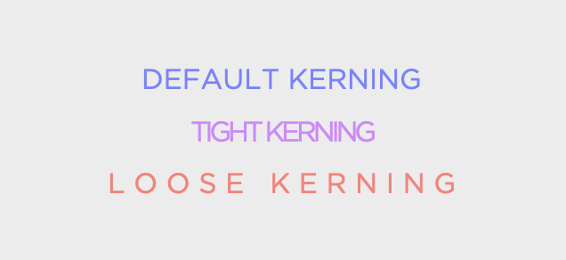
Kerning is the space between individual characters. Tight kerning can help squeeze more text into a single line, but it can also create legibility issues if used too aggressively. On the flip side, loose kerning can help you fill negative space (which can be helpful if you want a line of copy to span a certain width).
Pro-Tip: In some design programs kerning may be called tracking or character spacing. When you enter type into a design, most softwares automatically set the kerning/tracking/character spacing to 0. In many instances, this default setting will work just fine. If you need to adjust it, smaller numbers (negatives) will tighten the kerning and larger numbers will loosen it.
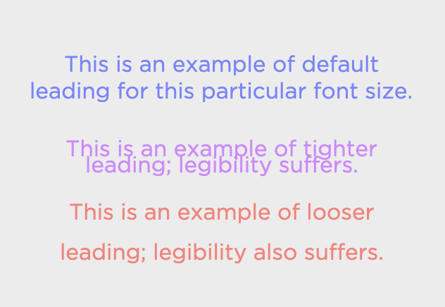
Leading (pronounced ledding, lead, like the metal) is the space between baselines. A baseline is the invisible line that your copy sits on. (Picture the red-and-blue lined paper you practiced your letters on in grade school. That colored line that the letters “sat” on is the baseline.) Tight leading can lead to crowded blocks of text with legibility issues, especially if the ascenders and descenders of letterforms begin to overlap. Looser leading creates lots of breathing room, but be careful that you don’t set things so loose that the audience can’t differentiate between paragraph breaks.
Pro-Tip: In some design programs leading may be called line spacing. In most software programs, as you change your font’s size, the leading will automatically adjust to what is deemed a comfortable and legible spacing. If you need additional adjustments from here, smaller numbers will put less space between your baselines and larger numbers will put more.
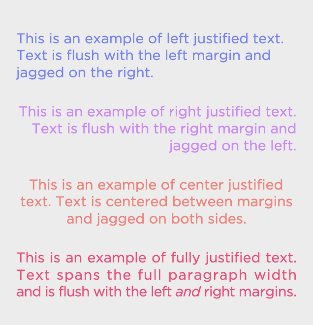 Justification is the alignment of the text within your paragraphs. There are several variations:
Picking the right alignment settings will aid in legibility of your piece. When you fully justify text, space is added between the characters so that your copy can fully span the text box, resulting in clean, flush lines on both sides.
The lessons in this workshop are left justified. The text is flush on the left and the right is jagged. This is a popular setting for most websites and word processing documents.
The vast majority of published novels are fully justified, with text spanning the width of the page, right up to the margin. Full justification can create unpredictable results, however, with lots of white space on some lines and really tight text on others. To help fix this issue, variations of full justified text allow the final line to be left-, right-, or center-justified. Open a novel and you’ll see this in practice. Paragraphs span the full page and are flush with the margins except for the final line of each paragraph, which is flush with the left margin and is ragged on the right, extending only as far as the sentence requires.
When deciding how to align your text in a design, consider hierarchy and how the eye will move through your piece. Changing justification throughout a piece may confuse for the viewer’s eye. Where are the margins? Can the piece be easily scanned? If you use full justification, pay extra attention to lines of text that appear too tight or too loose. To fix these, you can force line breaks, add a hyphen to break a word, play with the kerning of an individual line, etc.
Pro-Tip: In most design programs, look for text or paragraph settings to find your alignment options. The default is typically left justified (flush left, ragged right), but for most design projects, there is no right/wrong way to align type. Update your settings as your design demands.
In this video, I’ll share a few designs and discuss how typography is being applied within the pieces.
For the best viewing experience, I strongly suggest watching in full-screen mode.
Based on the type of design projects most authors tackle, it’s easy to say that the most important information in your designs will often be communicated via type. Making sure your typography choices are impactful and legible is crucial.
Some best practices to keep in mind when working with tyography:
DO use your book’s cover as a starting point when selecting fonts.
DO pick fonts that are legible, pair well together, and invoke moods appropriate for your project.
DO aim to use only two drastically different colors for all your copy.
DO check for legible applications of kerning, leading, and type justification.
DON’T use display or script fonts for small-sized copy.
DON’T use more than two font families unless absolutely necessary.
DON’T set leading so tightly that ascenders and descenders begin to overlap.
DON’T change a font’s color/size so many times that your design loses all hierarchy.
We spent a little time discussing how to space and arrange typography artfully in this unit. Now it’s time for a deep dive into arranging all the elements in your design. Ready to kick off the final fundamental?
Start Unit Five: Spacing + LayoutIf you have technical issues or need to reach me directly, please send an email.