This unit contains seven lessons. Work through the content in order.
Color and contrast work hand in hand, but to ease into things, will start by focusing on color.
Color theory is complex—I could easily do an entire workshop on it. But I can simplify things for this course because as an author, you are in a unique position. When selecting colors for a design, authors rarely work from scratch. Instead, a color palette often comes to the author by way of their book’s cover art.
If you’re a trad author, your publisher designed and supplied this cover. If you’re indie, you likely worked with a professional designer to create your book’s artwork. Within this cover lurks a color palette—one that you can use as a starting point for any design projects you tackle that are related to this book!
But Erin, you say, what if I’m taking this course so I can design my own cover? What an undertaking! Good for you. Your work will be a bit more challenging because you’re designing from the ground up.
In fact, even trad authors occasionally need to design from the ground up. Remember when we talked about purpose and I outlined how some design’s will have broad goals? If you’re creating a header graphic for social media, for example, or a logo for your website or newsletter, you’ll be starting with a blank canvas. There is no cover art to pull a palette from.
So let’s talk a bit about color theory…
A basic understanding of color theory will allow you to strengthen your designs. If you’re working from a supplied cover, this unit will help you identify your cover’s color palette and, in turn, the general color scheme you should continue to design within for your graphics and/or promotional materials. If you’re working from the ground up on a unique design (eg: book cover, logo, branding work), this unit will help you pinpoint what type of emotions you want your design to illicit and how you can communicate that with your color selections.
Let’s dig in…
Color theory is a collection of rules and guidelines used to communicate with an audience through appealing color schemes. To pick these appealing schemes, designers use a color wheel, first invented by Isaac Newton in the 17th century.
The color wheel arranges colors in their natural progression on a rotating disk. By selecting certain color temperatures (warm vs cool) and color schemes (geometric combinations from the wheel), designers can create harmonious, meaningful palettes.
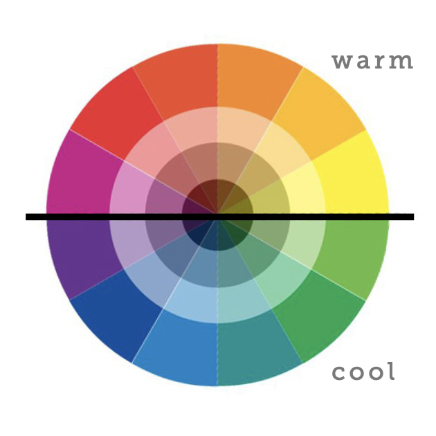
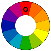
The most simplistic way to break up the color wheel is to look at color temperature. Colors can be perceived as either warm or cool. As seen above, these temperature groups sit on opposite side of the wheel.
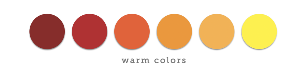
Reds, Oranges, and Yellows are WARM colors, associated with energy, passion, and urgency.
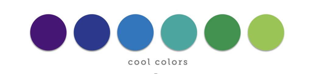
Greens, Blues, and Purples are COOL colors, associated with nature and relaxation, and are more subdued than warm colors.
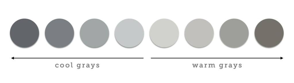
You may notice that pure black and white don’t live on the color wheel. That’s because white is the absence of color and black is all colors at once. Black and white are considered NEUTRALS, along with varying shades of gray.
The impact of a neutral gray depends on what other color hues exist within the gray hue. For example, a gray will feel cool if it has blue (cool) undertones in it. A gray will feel warm if it has yellow (warm) undertones in it. These temperatures will only strengthen if the gray is then paired with additonal colors from the same temperature family. (E.g.: steel gray + blue = a cool family ; tawny gray + orange = a warm family)
Color is extremely emotional. Humans are quick to associate colors with certain feelings and experiences. For example:
We see these emotions (messages) communicated in the design of everyday objects. A stop sign is red to communicate urgency. Stop here! A warning label may be red for the same reason. This is dangerous, don’t eat it! This is why a waiting room at the doctor’s office isn’t red, but instead white or perhaps a very pale blue or cool gray. Something that communicates, This is a calm, clean, soothing space. You can relax here.
You’ll notice that many high-energy emotions are on the warm side of the wheel and the lower-energy emotions are cooler. You can communicate a lot with a single color single color.
But most designs aren’t simply one color. So let’s talk a bit about how colors work together…
A color scheme is a pairing of harmonious colors for use in a design. Color schemes begin with the selection of a base color. The base color’s position on the color wheel then dictates which additional colors should also be used.
Let’s take a look at a few of the most popular color schemes:
Monochromatic means “containing or using only one color.” A monochromatic color scheme selects a single base color from the wheel and uses varying shades of that base in the design, nothing else. If the base color is fire truck red, this means all other colors in the scheme would simply be lighter reds (E.g.: blush) and/or darker reds (E.g.: burgundy).
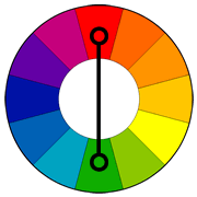
Complementary colors are on opposite sides of the color wheel. Red and Green. Blue and Orange. Yellow and Purple. Complementary colors are extremely high contrast (more on contrast soon), which means they can be illegible if used for large blocks of copy but very powerful and attention grabbing when it comes to visual design.

 Analogous
Analogous colors are positioned next to each other on the wheel, with the base color being the color in the middle. Because analogous colors are often in the same temperature family and always illustrate a natural progression of color changes, they immediately create harmonious designs.
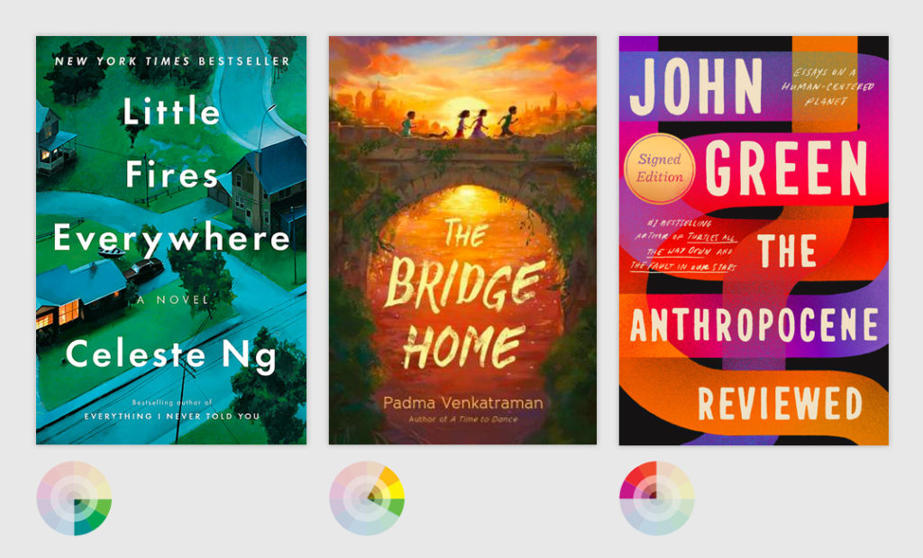
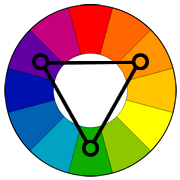 Triadic
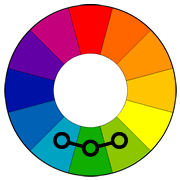
In a triadic scheme, colors are evenly spaced on the wheel. The wheel is essentially split into thirds, with one color being selected from each segment. Triadic schemes create vibrant designs, even if some of the hues are muted and subdued.
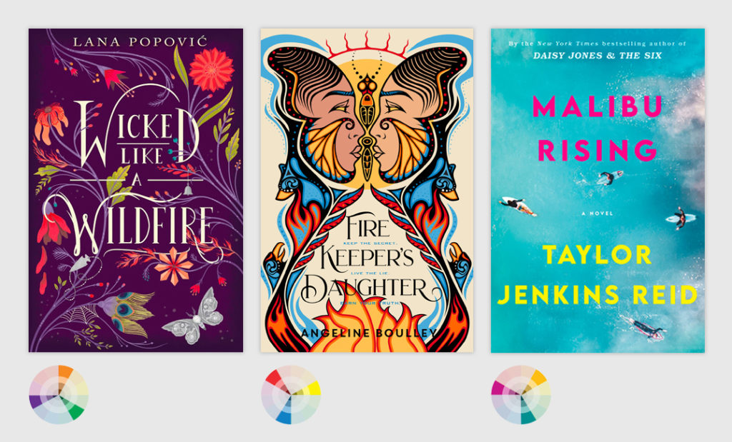
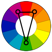 Split Complementary
This is a variation to the complementary colors scheme, but less intense. A base color is chosen from one side of the wheel, then two supporting colors are chosen from beside the color opposite the base. The result is two similar colors from one temperature family, paired with one color from the opposite temperature group.
Pretty cool, right? But understanding color schemes is simply the foundation work for what comes next: selecting colors to use in your designs…
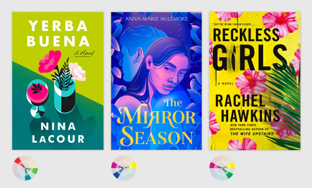
As an author, your color palette (or at least a hint of it) will be delivered to you via your book cover. Your job is to use your understanding of color theory and color schemes to identify which colors you’d like to “pull” from your cover and use as your core palette while designing.
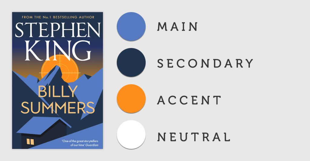
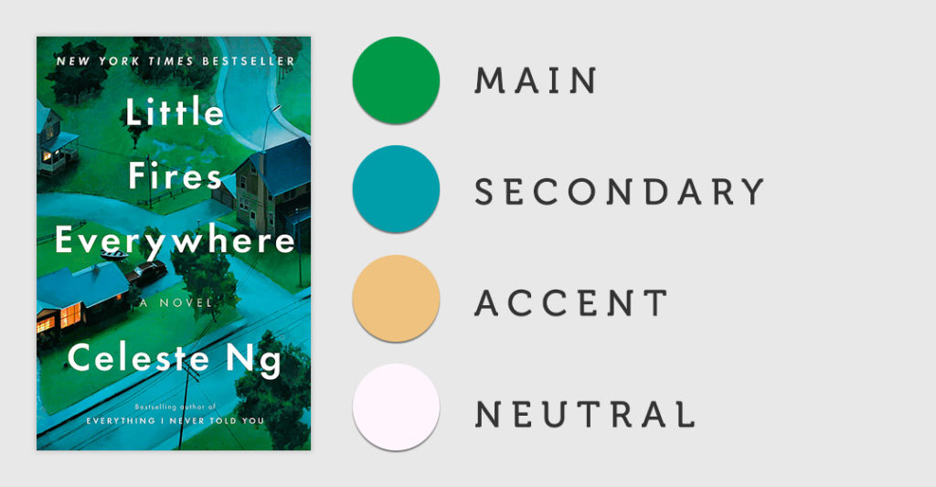
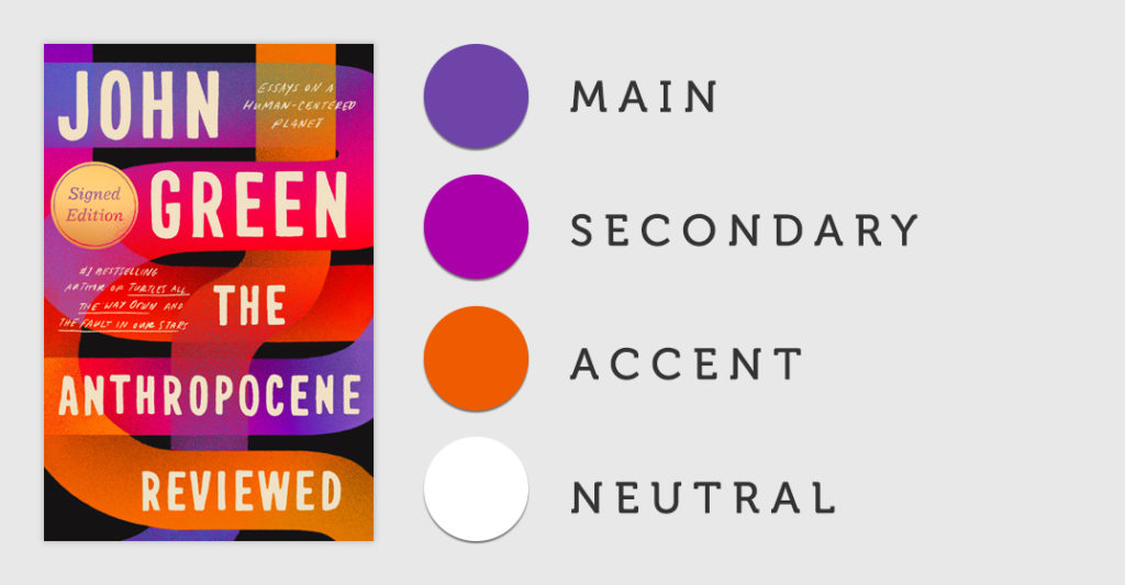
A good rule of thumb for beginners is to aim for 3-4 colors when selecting your palette. Your palette should include, at minimum, a main color, an accent color, and a neutral.
How do you select these colors? Walk through the following steps:
In some instances, you may feel like three colors isn’t enough. Add a fourth and have it serve as a secondary color — something that similar to your main color or perhaps even a second accent color.
In short, the palette selection formula looks like this:
Keep in mind that neutrals can fill any place in the formula. A neutral can be an accent color, or even a main color. Some designs may have two neutrals in the palette, and that’s totally okay.
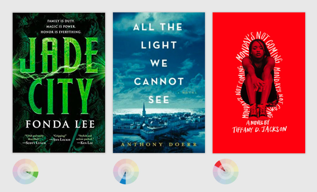
Here are some sample palettes that I might work with if I were designing promo graphics for a few of the books we looked at earlier:

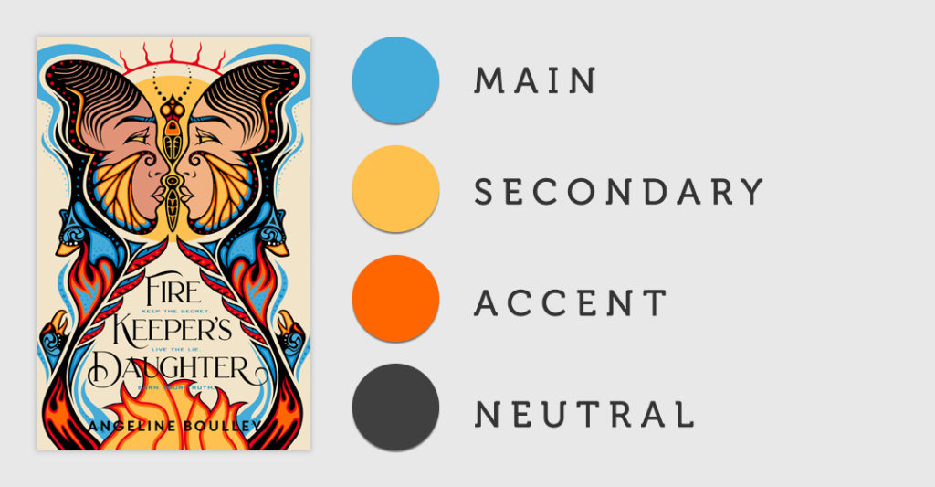
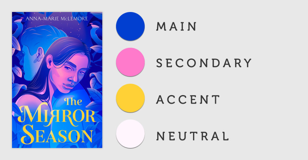
Pro-Tip: This course is about fundamentals, not how to use design software, but I would be remiss to not mention the “eyedropper” tool at this point. Most design programs have an “eyedropper” feature. This tool allows you to hover over any part of an image and click, selecting that exact color value. The eyedropper tool can be immensely helpful when it comes to “pulling” colors from your cover as you develop your palette.
If you have a sharp eye, you may have also noticed that many of the accent colors in the above examples are warm, bright colors (like yellow and orange) while many of the main colors are cool (like blue or purple) or, if warm as in the Monday’s Not Coming example, very saturated/dark.
There’s a reason for this, and the answer is CONTRAST. You want—and need—strong contrast between any accent pieces of content and background elements (which often lean on the main/secondary colors) in order for your piece to be legible. (More on contrast in a moment.) But remember that drastically different colors will also pull the audience’s eye through the piece. As we learned with in the hierarchy unit, color changes is one of the key ways to denote hierarchy.
Too many colors can complicate legibility of your design, so you may want to limit your palette to a total of three drastically different colors. Many of the above examples do this. Example: Billy Summers and Little Fires Everywhere both have four colors in the palette, but only three drastically different colors.
Of course, there are always instances where it makes sense to break rules. If your palette ends up containing color selections that are all drastically different from one another, simply take extra care when deciding how and where to use each color so that the hierarchy of information within your design doesn’t suffer.
If you’re not using a book cover as your starting point while designing, don’t fret. The main color + accent color + neutral formula will still help you build a palette. Reflect on color theory (temperature, emotions) to pinpoint what you want to communicate with your design and, in turn, identify your main color. From there, choose additional colors as necessary to round out your palette.
The formula for color palette selection isn’t foolproof, but it’s a great starting point for nearly all design projects.
The previous sections mentioned “high contrast” a few times, and perhaps you weren’t clear on what that meant. Let me explain.
Contrast is the difference between two colors, and it is the key to legibility. The stronger the contrast between text and background, the better the legibility. As contrast weakens, legibility weakens too. Black and white provide the highest possible contrast.
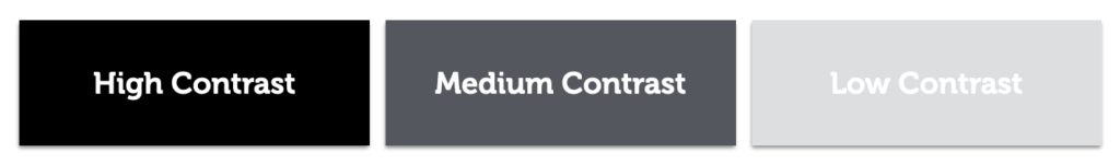
In the above, both the high and the medium contrast examples are easily legible. This is because the difference between the text color and the background color is great. The difference between the words “low contrast” and the background, however, is much less, creating low contrast and poor legibility.
However, the above examples all use a large font size and minimal amounts of text. They are what we’d call “title” or “headline” copy. When you have large amounts of text, known as “body” or “paragraph” copy, extremely high contrast can quickly become hard on the eyes.
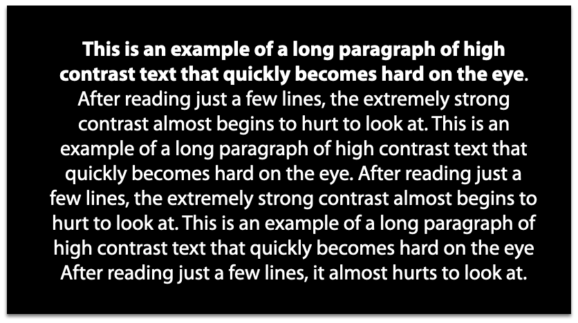
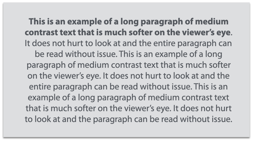
In the above examples, you can see how medium contrast is actually preferable to high contrast. It’s still perfectly legible while also being gentle on the eyes.
Just like color selection, contrast is yet another way you can stress importance. Think back to our hierarchy fundamental. Which information is the most important info in your design? This piece of content may benefit from having strong contrast, while lower priority information would likely do best with a medium level of contrast.
Contrast won’t always be about colored text against a solid colored background. Sometimes your background may include imagery (photography, illustration) or even multiple colors (a gradient).
As you combine text and backgrounds, always be aware of the contrast between both these elements. Take a look at these examples, where legibility is lost in the first row due to poor contrast and then corrected in the second.
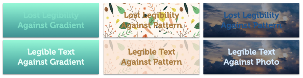
Playing with the hue of a background color or the color of your text can increase contrast and, in turn, legibility. You can see this at work in the first and third examples. In the middle, the text remained the same color and a semi-transparent layer of peach was added above the background pattern but beneath the text, instantly improving legibility.
Pro-Tip: In design programs, “layers” allow you to move, edit, hide, lock, and work with the certain content without affecting the content that lives on other layers. Layers stack on top of each other, like a sandwich. For example: A layer made up of a solid color may serve as the background to your canvas, your book cover may be on another layer, headline copy on a third, body copy on a fourth, and so on. If you added another layer on top and filled it with a solid color, it would cover/hide everything underneath, like the top piece of bread hiding everything within the sandwich.
As you design, be sure to always check for good legibility of copy. If the contrast isn’t strong enough between your text and the background element, try changing the color of your font to see if you can get it to pop more. Simply making the text lighter (or darker) could do the trick. If that doesn’t work, you may want to change the opacity (transparency) of the background itself or, as in the middle example above, add another layer of semi-transparent color between background and copy.
Pro-Tip: Many design programs allow you to add a “drop shadow” to your copy. When used sparingly, this effect can instantly improve contrast (legibility) between text and the layers below.
In this video, I’ll share a few designs and discuss how color and contrast are applied within the pieces.
For the best viewing experience, I strongly suggest watching in full-screen mode.
Remember, a harmonious color palette is crucial when it comes to branding your design to your book or simply to you, the author, and contrast between the colors you select will aid in legibility.
Some best practices to keep in mind when working with color and contrast:
DO use your book’s cover as a starting point to develop a color palette when applicable.
DO use the 1 main color + 1 optional secondary color + 1 accent + 1 neutral formula.
DO remember that neutrals can fill any role in the formula.
DO check for strong (but not jarring) contrast between text and background elements.
DON’T use more than three drastically different colors.
DON’T use high contrast color combinations for large blocks of text.
Phew! Color + Contrast is a big one. Now it’s time to move to focus on typography—the words you put on in your design, what font you display them in, and how you display them (size, placement, alignment, and more!)
Start Unit Four: TypographyIf you have technical issues or need to reach me directly, please send an email.